


The Luminaries —
Full Archive
Project Description
The Luminaries is a visualisation of Eleanor Catton’s Man Booker Prize–winning novel of the same name. The project was conceived with the intention of illuminating certain structures that were previously hidden or subtly hinted throughout the book.
Research, Art Direction, Visualisation & Design
Lara Loi
Academic Guidance
Danné Ojeda Hernandez
Astrid Kensinger
Year of Completion
2015
About This Page
This page is created to archive in detail, the process, outcome and motivation behind this year-long graduation project, completed under the School of Art Design and Media, Nanyang Technological University, Singapore. This project was also exhibited at the 2015 ADM Graduation Show.
Keywords
data visualisation; small data; information design; information graphics; print design; poster design; editorial design; risograph printing; the luminaries; literature; historical fiction; novel
Introduction
The Luminaries, a Man Booker Prize-winning novel written by Canadian-born New Zealand author, Eleanor Catton, is a classic mystery fiction set in the 19th Century New Zealand gold rush in Hokitika. The story was built on themes, character profiling and events influenced by strict astrological principles. Apart from the narrative, Catton has also placed strong emphasis on the novel's physical structure, in particular, the number and word length of parts and chapters to reflect the waning cycle of the moon.
This project is a visualisation of Catton’s book. It is created with the intention of highlighting and making obvious certain structures that were hidden or otherwise hinted at throughout Catton’s writing. As a parallel to Catton using astrology as a system to craft her narrative; this project will use visual systems, relating to information design, to interpret her novel. The visualisation approach also seeks to explore methods of applying visual design to written/textual materials.
The process of visualising starts with the dissecting, breaking down, and curating of data from the original novel. Visual systems and charts will then be designed and applied to this compilation. All visualisation outcomes are to be digitally constructed for it to be as true and accurate to the original content as possible, without revealing and thus spoiling, the plot for the audience.
About The Novel
The Luminaries used in this project is the paperback edition published by Granta Books, first published in London in 2014. This paperback edition consists of 12 parts, 78 chapters, 832 pages, 7843 paragraphs and over 266,000 words. Other than the printed book, similar editions in audio format and in digital E-book formats were also published, one of which also used in this project was The Audible Audio Edition audiobook, narrated by Mark Meadows and published by Audible Studios in 2013, that consists of roughly 30 hours of recording.
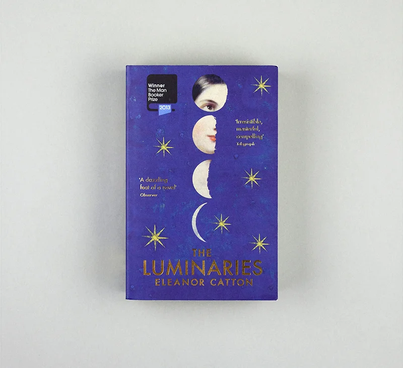
The Luminaries is Eleanor Catton’s second novel. The book won the 2013 Man Booker Prize and the Canadian Governor General’s Literary Award for fiction. At the young age of 28 in 2013, Eleanor Catton, broke several records with The Luminaries—the most prominent being that she is the youngest author to win the prestigious Man Booker Award, and her 832-page story is the longest Booker winner ever written to date. She started writing the book when she was 25 and took 2 years to complete it.
Born in Canada, raised in Christchurch, New Zealand, Catton was especially fond of Hokitika, a small historic township located in the West Coast Region of New Zealand’s South Island. With the whole story of The Luminaries set in this location, Catton had hoped to bring in more visitors to her native land through the success of the book. The Luminaries has been so well sought after that British producer Andrew Woodhead had plans to turn the story into a televised mini-series.
The story, heavily influenced by the West Coast Gold rush in the 19th century, reads like a big adventure story, exploring themes of mystery and conspiracy. The most consistent motif throughout the book has been an enormous pile of gold that connects all the main characters. This gold, having passed through many different hands, is used to highlight the main explorations of the book, including the schemes, blackmails, romance and connections amongst characters.
In The Guardian Books Podcast, presented by Claire Armitstead and John Mullan, and produced by Tim Maby, Eleanor Catton, mentioned that first and foremost, the novel needed a huge plot that was simultaneously enjoyable and entertaining at first read. And upon repeated readings, readers are to find a secondary meaning that has been built into the novel. To do so, Catton has imposed a strict structure, heavily influenced by her passion for astrology, in her plot. She started her research by studying the night skies during the period of the Hokitika gold rush, starting from mid 1864, until 1868 when the gold rush ended; taking notes of the placement/alignment of the planets, of constellations and traced all the celestial events that occurred. This research in turn determined and influenced the narration and the structure of her plot. She hinted at the use of astrology by adding a chart at the beginning of each part. The movement of the charts are intrinsically accurate to the events of each specific part.
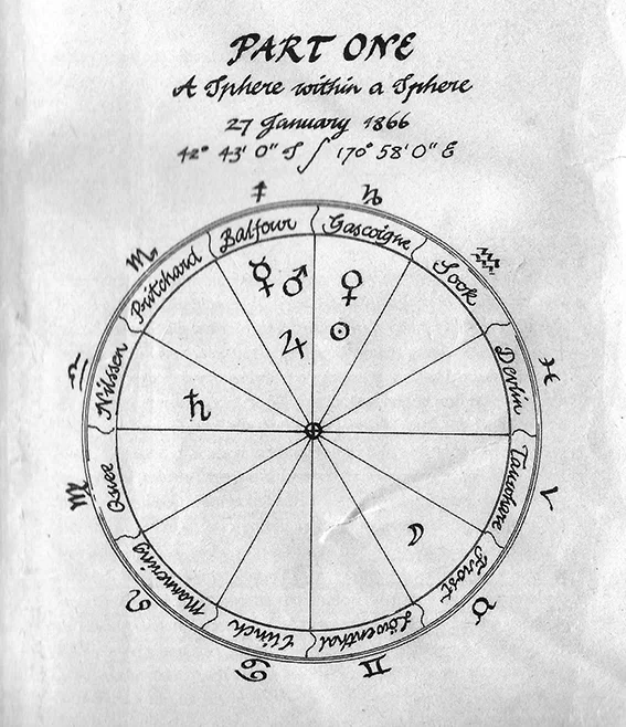
Catton presented a chart at the beginning of each part.
1. Character profiling
There are 20 main characters in total, whose profiling is strictly influenced by their groups. Characters are grouped as such:
Stellar—Profiling of characters grouped under Stellar are influenced by the twelve astrological characteristics of zodiacal constellations.
Te Rau Tauwhare (Aries)
Charlie Frost (Taurus)
Benjamin Lowenthal (Gemini)
Edgar Clinch (Cancer)
Dick Mannering (Leo)
Quee Long (Virgo)
Harald Nilssen (Libra)
Joseph Pritchard (Scorpio)
Thomas Balfour (Sagittarius)
Aubert Gascoigne (Capricorn)
Sook Yongsheng (Aquarius)
Cowell Devlin (Pisces)
Terra Firma — Terra Firma is Latin for “solid earth”. Only one character is grouped here.
Crosbie Wells (deceased)
Planetary—Profiling of characters grouped under Planetary are influenced by the astrological attributes of celestial planets.
Walter Moody (Mercury)
Lydia Wells, Carver (Venus)
Francis Carver (Mars)
Alistair Lauderback (Jupiter)
George Shepard (Saturn)
Anna Wetherell (The Sun/The Moon)
Emery Staines (The Moon/The Sun)
In the larger picture, these 20 main characters are primarily related to each other by an enormous gold fortune. Within these characters, there are several pairings and cliques, which are predetermined by their celestial influences. For example, Jupiter governs Sagittarius; therefore Thomas and Alistair share a special bond.
2. Book Structure
Other than the structure of the plot, Catton also heavily emphasised on the novel’s physical structure. There are 12 parts in total. The first part consists of 12 chapters, the second part 11 chapters; the number of chapters subsequently decreases exponentially until part 12, which only has 1 chapter.
Catton was not only meticulous about how the book was segmented, she was also careful with the length of the chapters. She made sure that each subsequent story part is half the length, in word count, of its preceding part. This is to symbolise the waning moon, a symbol of rebirth and renewal. The book was not written in chronological order. Each story part is dated and the idea of renewal is further emphasised as Part 1 of the book dates exactly after Part 12, suggesting that the novel plays out in a cyclical fashion, much like the lunar cycle.
About Visualising Information
Visual Communication, by common definition, is the conveyance of information and concepts through visual aids. It relies primarily on visuals and is often presented in two dimensional images.
A huge area of Visual Communication involves Information Design. Information Design is a term broadly used to describe a communication discipline which main intention is to inform and explain, as opposed to persuasive approaches commonly used in advertising practices. Common outputs of information design include way-finding systems, information graphics, data visualisation, information systems, maps, and etc. Here is a list of terms that briefly defines several visual tools that would be useful for this project:
1. Terms relating to Information Design
Information Graphics—Information Graphics, or Infographics, is a term used to describe a visual explanation of information that cannot be communicated effectively otherwise without the aid of visuals. For example, you could not communicate geography without showing the visuals of a map (topographical information).
Information Systems—Information systems are visual systems that are created either manually or with the aid of a computer. These systems are used to process or interpret information.
Data Visualisation/Information Visualisation—Data Visualisation often deals with semantics and is a visual representation of collected data. Complex data should translate into complex visualisation. This term is also often referred to in the scientific community as “the use of computer-supported, interactive, visual representations of abstract data to amplify cognition,” according to Readings in Information Visualisation: Using Vision to Think by Card et al.
2. Advantages and Disadvantages
Advantages—Graphics and visuals, when used correctly and effectively, can be an extremely powerful tool for communicating information. Visual systems could simplify and explain complex material and data, in turn highlighting and making visible hidden structures and patterns, that were previously not obvious in another medium. Visuals could manipulate the speed of how ideas and information are to be conveyed. It can rouse and inspire interest, discourse and debates. When intended, it could encourage discussions and promote creative interaction and response.
Disadvantages—It is very easy to misuse visuals if one is not skilled and sensitive to the consequences of its impact. Very often, design outputs, relating to visualising information, emphasise too much on visuals and aesthetics that sometimes there become too much graphics and too little information. Visuals could be used to impart information, and they could also just as easily mask and hinder the conveyance of information. When not sensitive to information hierarchy, it becomes easy to confuse and lead to miscommunication. The lack of technical and aesthetic competence may also obstruct the communicative power of visuals. The choice of the wrong medium could also draw unwanted attention to unintended details.
3. Ethical Considerations
All visualised information should be handled with integrity and honesty. Information visualisation can easily mislead and even be a tool for lying or propaganda. Due to the nature and aesthetics of information visualisation, especially data visualisation, we often trust it to be accurate and veracious. The use of collected information, especially numbers, could easily add gravitas to any project. Because visualised information requires a lot of effort in terms of the curation and the extraction of data, as well as the application of visual systems, the involvement and relevance of a designer becomes very obvious. As such, visualised information is often viewed with more seriousness and held at a higher standard as compared to a simple graph.
Like any tool, the visualisation of information can be easily manipulated. The responsibility falls on the shoulder of the designer to treat any information with integrity and consideration. That being said, it is often harder to lie with data. If an output relies heavily on collected information from a fixed source, the outcome could still easily be verified by a third party.
Visualising Literature
The notion of visualising literature is not uncommon. Outputs from these projects stem from various motivations. Some are intended to explore the themes or writing style of a book, while others take on a more fine art approach.
Here are some case studies which uses visuals to interpret written materials. These case studies have in some ways helped in developing this project and the refinement of its concept.
Case Study 1 — Romeo & Juliet by Beetroot Design Group
This self-initiated project by Beetroot Design Group experimented with text in the classic Shakespeare’s Romeo & Juliet literature piece. They connected all “Romeo”s (the name) to all “Juliet”s (the name) with red lines, in turn visualising the connection involving these two tragic characters in the classic.

Left: Romeo & Juliet Poster / Right: A close-up image of the poster
(Images retrieved from www.beetroot.gr)
Case Study 2—Writing Without Words by Stephanie Posavec
Writing Without Words was a final year MA project by Stefanie Posavec. This project was conceived with the intention of visualising the differences in writing styles when comparing authors to one an other. The main text used was On the Road, by Jack Kerouac. The data collected includes sentence lengths, punctuation, and text structure.
Writing Without Words Posters (images retrieved from www.stefanieposavec.co.uk)
Case Study 3—Poetry on the Road by Boris Müller
Boris Müller has been commissioned, since 2002, to design the visual themes for the annual Poetry on the Road international literature festival. While the theme changes every year, his approach has always been the same, which is to use computer programs to generate images out of text, translating its content into key graphics.
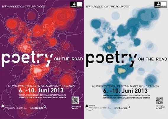
Poetry 2013 by Boris Müller (images retrieved from www.esono.com)
The Approach
The initial approach to the project was to start by reading and rereading the book several times to select the information and data to be extracted. It was initially assumed that once information is pulled out from the source, it could be later decided and curated in order for it to make sense. However, this approach failed as data is essentially useless unless the intent is clear and a system is applied to it.
Quoting Joris Maltha in an interview in Thoughts on Designing Information (2014), “Data in themselves are not information. Information comes after certain editorial steps in order to tell the story with data. Data in themselves are quite useless.”
It was later realised that the same data source can keep producing various data depending on how you mine it. The possibilities are almost endless. Without a clear intent of what angle to present the information in, it becomes easy to mindlessly extract data without knowing what it is for, causing the entire process to be ineffective. It was a misconception to think that the intent and design should come after the extraction of data.
After having a basic understanding of the information source, in the case of Catton’s The Luminaries, it was understood that there needs to first be a conscious intention of knowing exactly what structure is to be highlighted from the novel, what patterns are to be exposed, and which visual systems (in the forms of charts and graphs) can be applied before diving into data mining. Once the visual structures have been worked out, it becomes clear exactly what data needs to be extracted. This will ensure maximum efficiency, especially when dealing with a huge source.
Designing the Charts
The process starts first with sketching. Books and existing diagrams were used to study how structure, techniques and applications were applied to their specific context. This helped to determine what kind of charts are suitable for what sort of information. These charts were then tested out on sample data to see its effectiveness.

Extracting Data
There are generally three kinds of information to extract:
1. Nominal Data
This kind of data has no quantitative values. Examples of such data include, names, objects and ideas. This data is often categorised. In simpler terms, we are grouping Apples to Apples and Oranges to Oranges with nominal data. Questions to ask are what and where, instead of how much or how often.
2. Ordinal Data
This data is information that could be arranged in a certain order or rank. With this information, we can tell which comes before another. However the intervals are not quantitative and cannot be measured. We will know that A is bigger than B but not bigger by how much.
3. Quantitative Data
This is essentially any data with numerical values that could be measured and manipulated. Quantitative data could be applied to ordinal data.
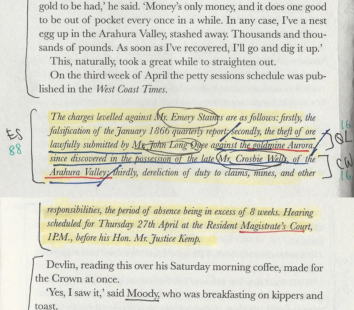
An example of how data was extracted
Referring to the image above, the highlighted yellow paragraph bears text relating to the pile of gold. Within this paragraph, 3 characters were mentioned — Emery Staines has a word count of 88, Quee Long has a word count of 16 and Crosbie Wells 16. The red underlined text suggests location mentions; in this case these locations are related to the pile of gold.
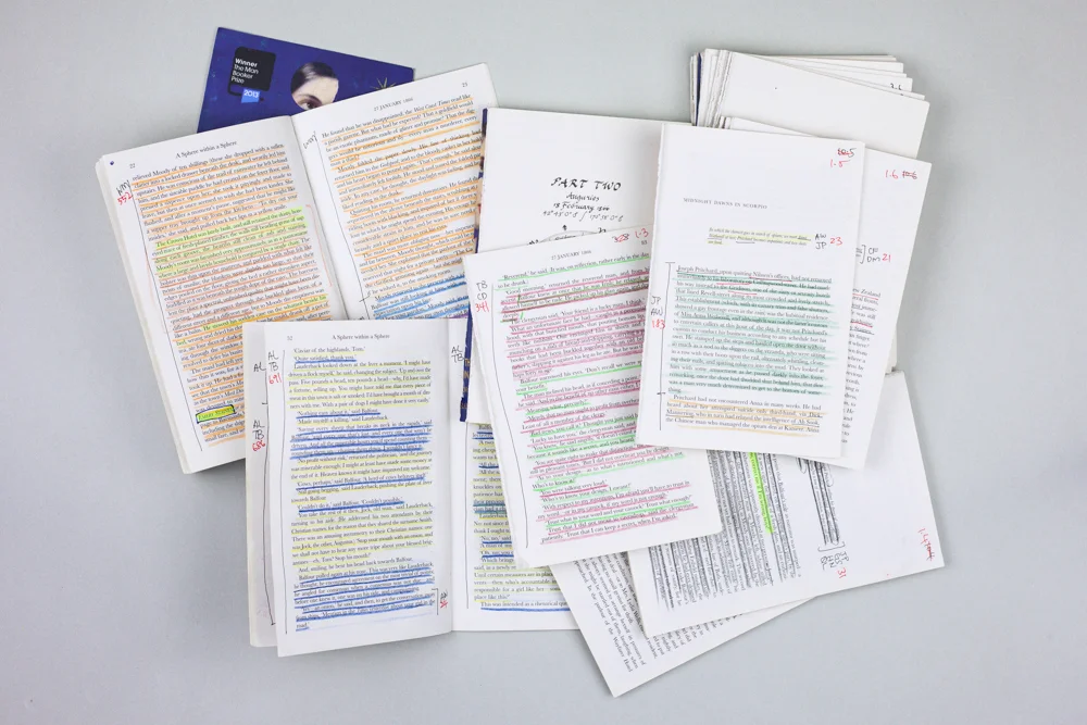
This same method has been applied to all 832 pages of the book. Before plotting these data into charts, the extracted values were organised manually by hand, and digitally with Microsoft Excel for data that are quantitative.


Project Outcome—
6 Pairs of 12 Posters
Dimensions
The posters, each measuring 260 by 400mm, is exactly 4 times the size of the original book. This dimension was arrived based on the intention to fold these posters into quarters, and to use them to make up parts of the process book which will be the same size as the original novel.
Colours
Two colours are used, Medium Blue and Flat Gold. The medium blue illustrates regular indicators related to the structures of the book and the flat gold illustrates indicators that suggest relations with the pile of gold. Medium Blue was used as it resembles the colours used on the original book cover.
Printing Method
These posters are printed by Push—Press, a local Risograph printer using the 2-drum Risograph MZ 770 Duplicator. The printing technique is very similar to screen-printing using a stencil-based process and spot colours. The colours produced are unique to this printing method only.
Diagram Medium
Digital vectors were used to draw these posters as it guarantees absolute fidelity to quantitative data.
Paper
Recypal 70gsm, supplied by RJ Paper, was used as its quality is most similar to the original novel.
*these posters shown below are digital renditions. images of the actual prints can be seen later in the photographs from the process book and exhibition. click image to enlarge


Project Outcome—
Process Book
The process book measures 130 × 200mm—the same dimensions as Catton’s The Luminaries paperback edition published by Granta Books.
The first half of the book talks about the process of the whole project; the second half of the book shows the project outcome.
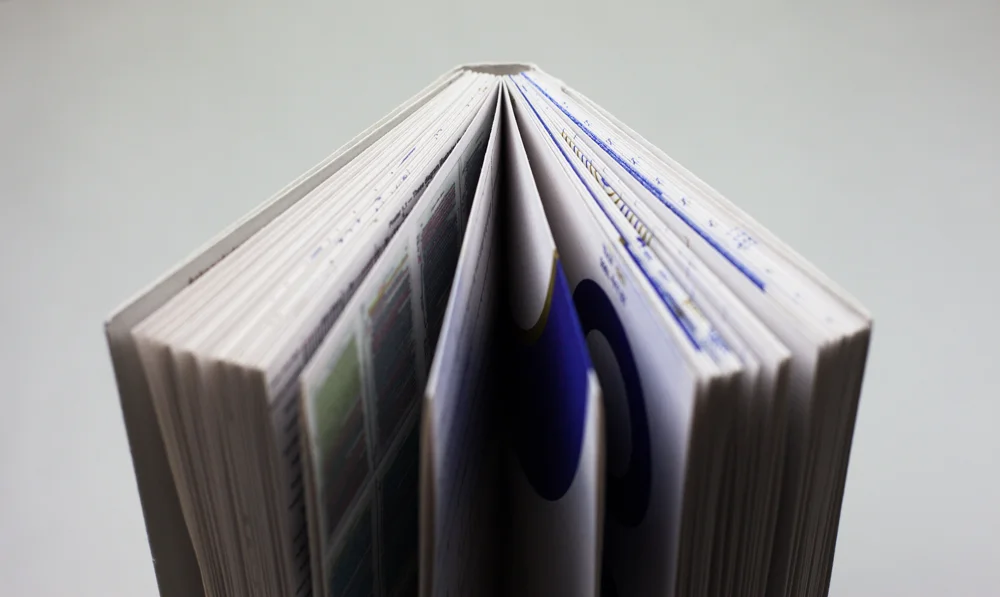
This book could be dismantled to form posters measuring 260 × 400mm. When bound, it has 12 signatures and 96 pages. Each signature is made up of 2 posters. When dismantled, there are 24 posters in total. The book’s cover can open up to form a poster that is 2 times the size of 260 x 400mm.


The Exhibition
The project was presented on a standard sized booth, displaying the 12 posters on the booth wall. On the pedestal, there will be 3 books—the original book in its mint condition, the dissected original book that was used in the process of data mining, and the process book that is from the outcome of the project.


Exhibition images photographed by Beton Brut
Acknowledgement
I owe particular thanks to Eleanor Catton for her book, The Luminaries, for it has been what inspired me to first conceive this project. Without her book, her meticulousness to details and far-sightedness to its structure, this project would not have been possible. This project has fuelled the start of a fierce interest in Data Visualisation, for it is the most appropriate medium that can bring together two of my biggest interests—Design and Fiction. I am grateful for this opportunity.
I would also like to acknowledge with gratitude my appreciation to Associate Professor Danne Ojeda Hernandez, my respective supervisor, for her guidance during the term of this project. She has been very patient and helpful. I am thankful to be taken under her supervision and have benefitted greatly from the consultations we have had regarding this project. This work could not have been completed without her valuable assistance.
I am also indebted to Assistant Professor Astrid C. Kensinger, my respective co-supervisor, for she has been very sincere and generous in providing references relating to information design and data visualisation. I have greatly enjoyed our conversations and discussions. Without her help and encouragement, this project would not have been as refined and comprehensive.
I would like to extend my thanks and appreciation to Adjunct Lecturer KK Ong, who has been my previous respective co-supervisor. I thank him, especially for his patience, assistance and generosity.
Finally, I would like to acknowledge and give thanks to all the faculty of the NTU, School of Art, Design and Media, especially Associate Professor Ina Conradi Chavez, who has been very kind to me, my school mates, friends and loved ones for their help and unwavering support throughout my whole academic term in NTU, School of Art, Design and Media.
Reference List
Selected Print References
Catton, E. (2013). The Luminaries. Granta Publications
Sless, D. (Spring, 1983). Educational Communication and Technology. Learning and Visual Communication, 21 (1), 58-60
Meirelles, I. (2013). Design for Information. Rockport Publishers
Card et al, (1999). Readings in Information Visualization. Using Vision to Think, 7
Gray, C. & Malins, J. (2013). Visualizing Research: A Guide to the Research Process in Art and Design. Ashgate Publishing, Ltd
Gobert, I., & Looveren, J. V. (2014). Thoughts on Designing Information. LUCA School of Arts and Lars Müller Publishers
Kondo, H. (1999). The Best Informational Diagrams. P.I.E Books
Rendgen, S. (2012). Information Graphics. Taschen
Martens, K (2004) Karel Martens: Counterprint. Hyphen
Holt, M., & Muir, H. (2006). 8vo On the outside. Lars Müller Publishers
Blauvelt, A. (1994). Design Writing Research. Visible Language
Tufte, E.R. (2001). The Visual Display of Quantitative Information. Graphics Pr
Selected Web References
The Man Booker Prize (n.d.) The Man Booker Prize 2013 Award List. retrieved April 27, 2015, from here.
Eleanor Catton (n.d.) Eleanor Catton Biography. retrieved April 27, 2015, from here.
Masters, T. (2013, October 15). Eleanor Catton becomes youngest winner with The Luminaries. BBC News, retrieved April 27, 2015, from here.
Gibson, M. (2014, February 4). The Luminaries is Headed to the Small Screen. Time, retrieved April 27, 2015, from here.
Armitstead, C., & Mullen, J. (2014, May 16). Eleanor Catton on The Luminaries – books podcast. The Guardian, retrieved April 25, 2015, from here.
Beetroot Design Group (n.d.) Romeo & Juliet. retrieved April 27, 2015, from here.
Stefanie Posavec (n.d.) Writing Without Words. retrieved April 27, 2015, from here.
Sher Chew and Berny Tan (n.d.) Isle-to-Isle. retrieved April 27, 2015, from here.
Boris Müller (n.d.) Poetry on the Road. retrieved April 27, 2015, from here.