


Visualising a work of fiction
Project scope
Information design and visualisation
Completed mid 2015
About the project
Titled The Luminaries, this was a project conceived with the intention to stretch the boundaries of information design, and to uncover hidden patterns of a written word novel by translating its story into ‘hard’ data (without spoiling the plot).
Tools
Microsoft Excel, Adobe Illustrator, Risograph printing
What was it for
A year-long graduation project, completed under the School of Art Design and Media, NTU, Singapore
How it started
It all started when I first finished reading The Luminaries — a Man Booker Prize-winning novel by Eleanor Catton, about a classic mystery set in the 19th Century New Zealand gold rush in Hokitika. Cleverly and beautifully written, the story was built on a strict and peculiar structure that was reflective of the writer’s passion for astrology.
In an attempt to understand this novel that was shrouded in mystery and conspiracy — all I wanted was to breakdown the book, to plot, to uncover and to illuminate structures that were hidden or subtly hinted throughout the book.
I knew as long as we have data, be it quantitative or qualitative, anything could be visualised, but the big question was…
“Can I visualise a novel without spoiling the plot?”
The approach
After rereading the book countless times, the actual process started with sketches to brainstorm the type of data that could be extracted.
By also referencing case studies by other artists, researchers, and designers, I studied how specific structures, techniques and applications were used in relation to their context and how it affects the message you intend to convey.
It was a constant process of testing out different types of visualisation using sample data, in order to determine which visualisation form fits the project’s intention best, while retaining the integrity of the data.

Extracting Data
There are generally three kinds of data that can be extracted:
1. Nominal Data
This kind of data has no quantitative values. Examples of such data include, names, objects and ideas. This data is often categorised. In simpler terms, we are grouping Apples to Apples and Oranges to Oranges with nominal data. The questions to ask are what and where, instead of how much or how often.
2. Ordinal Data
This data is information that could be arranged in a certain order or rank. With this information, we can tell which comes before another. However the intervals are not quantitative and cannot be measured. We will know that A is bigger than B but not bigger by how much.
3. Quantitative Data
This is essentially any data with numerical values that could be measured and manipulated. Quantitative data could be applied to ordinal data.
An example:
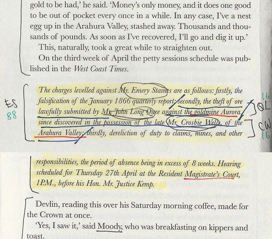
The above highlighted yellow paragraph bears text relating to the conspired pile of gold. Within this paragraph, 3 characters were mentioned — Emery Staines has a word count of 88, Quee Long has a word count of 16 and Crosbie Wells 16. The red underlined text suggests location mentions; in this case these locations are related to the pile of gold.
This same extraction method was applied to all 832 pages of the book. Before plotting these data into charts, the extracted values were either organised manually by hand (for nominal and ordinal data), or digitally by Microsoft Excel (for quantitative data).


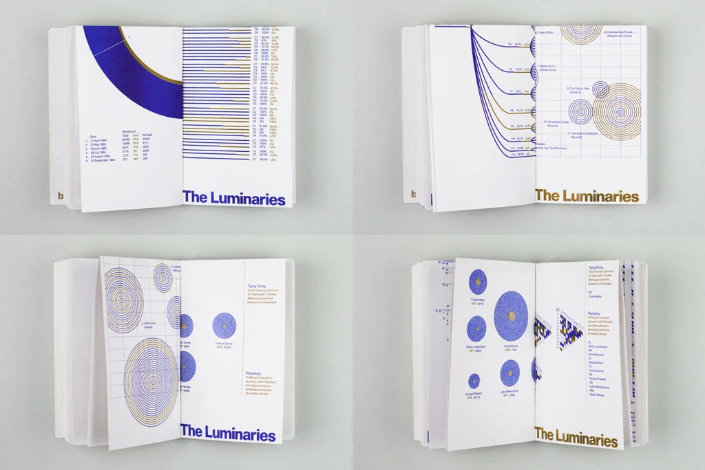
The outcome —
set of 6 pairs of posters
Curated Dimensions
The posters, each measuring 260 by 400mm, is exactly 4 times the size of the original book. This dimension was arrived based on the intention to fold these posters into quarters, and to use them to make up parts of the process book which will be the same size as the original novel.
Indicative Colours
Two colours are used, Medium Blue and Flat Gold. The medium blue illustrates regular indicators related to the structures of the book and the flat gold illustrates indicators that suggest relations with the conspired pile of gold.
*these posters shown below are digital renditions. click to enlarge
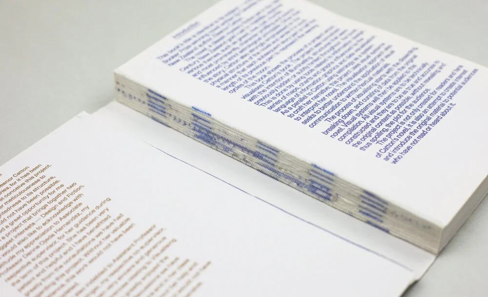
Documenting the process (in a book)
The process book measures 130 × 200mm—the same dimensions as The Luminaries paperback novel.
The first half of the book talks about the process of the whole project; the second half of the book shows the project outcome.
This book could be dismantled to form posters measuring 260 × 400mm. When bound, it has 12 signatures and 96 pages. Each signature is made up of 2 posters. When dismantled, there are 24 posters in total. The book’s cover can open up to form a poster that is 2 times the size of 260 x 400mm.


The Exhibition
Exhibited at the 2015 ADM Graduation Show, the project was presented on a standard sized booth, displaying the 12 posters on the booth wall.
On the pedestal, there were 3 books—the original book in its mint condition, the dissected original book that was used in the process of data mining, and the project’s process book.


My takeaway
Due to the nature and aesthetics of information design, we often trust it to be accurate and veracious. The use of charts, and especially numbers, could easily add gravitas to any data sets.
In a quick glance, anyone could have passed off the above diagrams as absolute and truthful. And yet, with this project, using a fiction based content, language can be interpreted in many ways, and meaning can be arbitrary.
Given the exact same visualisation tools and mechanism, another designer/reader could have easily charted the graphs differently based on how they interpret the book.
This truly made me ponder on the involvement and relevance of a designer, and our responsibility to treat the display of any information with integrity and careful consideration. A humble reminder to always keep our bias in check.