


Redesigning the typical outpatient care experience
Project type
UI design for a high-fidelity app prototype — to be used for user testing, workshops, and usability research
Completed late 2018
My role
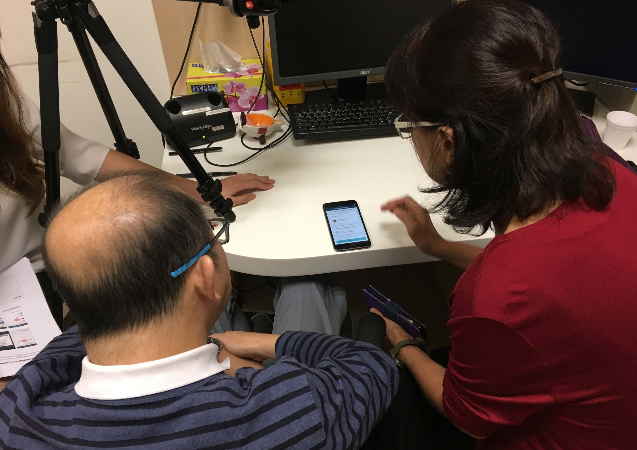
Working under a regional design consultancy for a client in the healthcare sector, I collaborated very closely with Senior Healthcare Design Consultants, to design an app prototype focused on new and improved ways of medical appointment booking.
Tools
Sketch, Invision
The larger project scope
This app design is part of a larger project scope, an end-to-end service experience redesign. The main overall project goal was to streamline the outpatient start-of-care (SOC) flow, and reduced wait time for patients.
The problem
To schedule for a medical appointment, users mostly have to secure a booking through phone calls or via walk-in enquiry in person. Booking via the website is not always available and is usually unreliable. The experience is often times inconvenient, stressful, and disjointed.
So we asked…
“How do we create a smarter, more human, and seamless scheduling experience for patients and care providers?”
The solution
To support the redesigned patient flow, we were to create a healthcare app that aims to optimise the outpatient care experience in 4 key areas:
01. Appointment Management
Booking appointment
Changing appointment
Cancelling appointment
02. Arrival Management
Pre-arrival check-in
Arrival registration
03. Itinerary Management
Notification for earlier slot
Ad-hoc test on top of appointment
04. Payment Management
Medication collection
Bill management
Digital Payment
The Process
Prior to me joining the team, the consultancy had previously engaged an external UI designer to kick start the app design. By then, it was already handed over in high-fidelity design.
When I took over, we immediately did an audit, to identify the key user flows, common use cases, and how to improve it to solve user pain points.

It was a repeated process of improving the design, sending it for user testings, gathering feedback and findings, and then back to the drawing board again to make it better.

Mapping the user flow


Key Features
01. Appointment Management

Actionable task always highlighted upfront on app landing screen

Book pending appointments with ease

24/7 access to all available time slots

Book with assurance by keeping your caregiver in the loop
02. Arrival Management
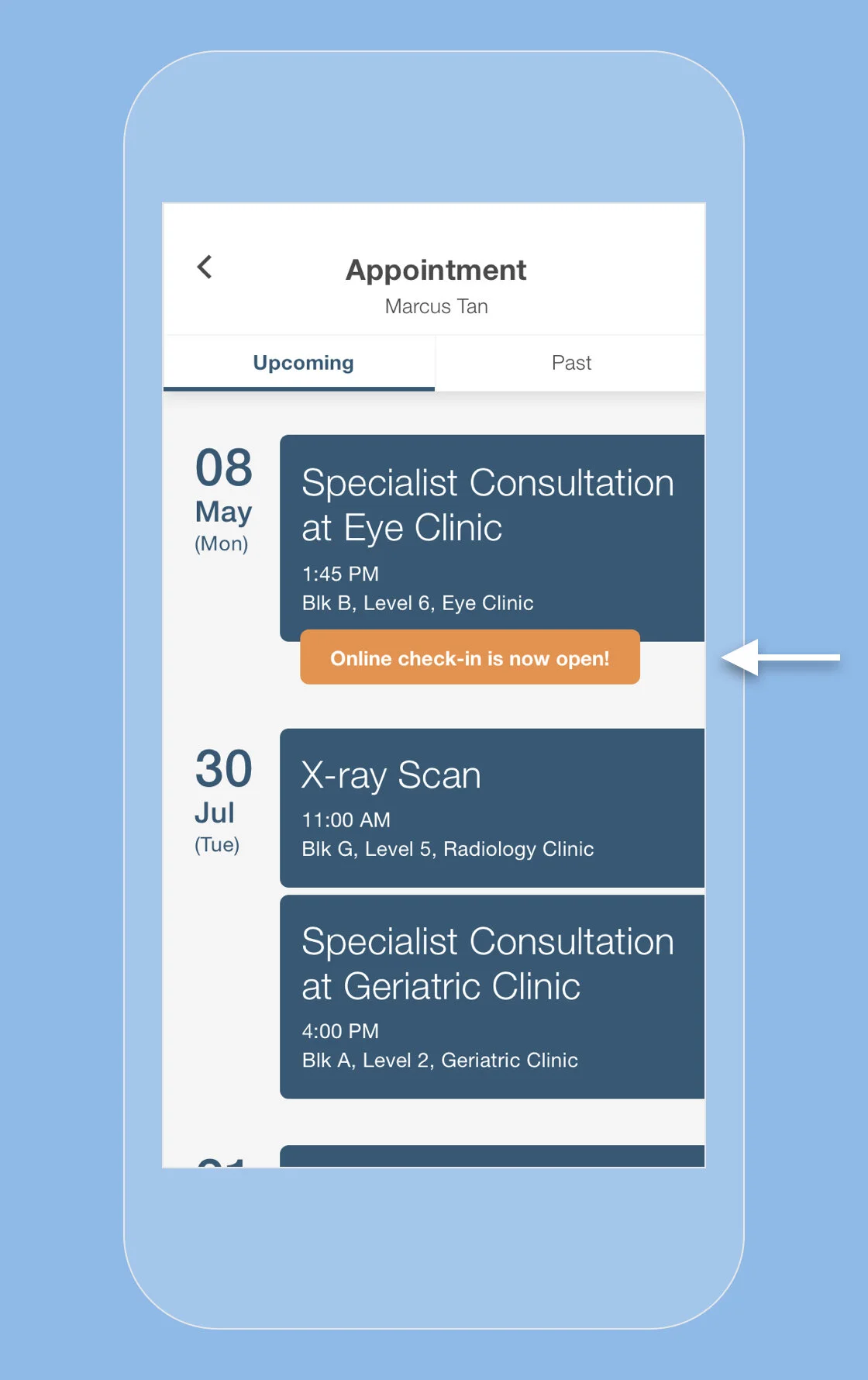
Confirm your visit before arrival to reduce wait time

Pre-arrival check-in provides necessary data for predicting no-shows

Location services can detect patient’s arrival onsite and immediately prompt registration

Skip the registration queue entirely by digitalising the form fill process
03. Itinerary Management

Clear visibility on any action point on main appointment page

Manage your time with concise and necessary information on waiting time and venue

Clear overview of start-to-end itinerary listing completed and upcoming tasks, so patients never get lost

Call-to-action items tied next to relevant task, specifically for actions that can be completed on app
04. Payment Management

Option to purchase and collect only necessary medication, instead of paying for the entire prescription at one go
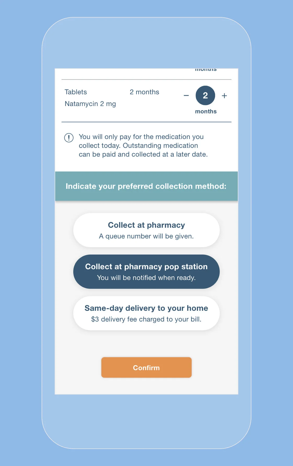
Reduce further wait time by choosing a collection method that is convenient for you

Clear breakdown of entire bill before payment allows users to backtrack and modify what they want to pay for

Skip the payment queue by opting for digital payment via the app
My takeaway
Conceived during the research stage, and for a new health campus in Singapore, it was liberating to be able to come up with design solutions freely without the constraints of pre-existing frameworks or tech limitations.
Having been a patient and caregiver myself, and experiencing first hand the frustration of booking a medical appointment, this was a project that I felt deeply relatable to.
Yet by feeling so attached, it became even more humbling when listening to our users — their feedback shed light on many different perspectives, some of which differed vastly from my own. “User-first” has never felt more relevant.
I’m eagerly looking forward to seeing some of these ideas get tested on and deployed in the real world setting soon.