


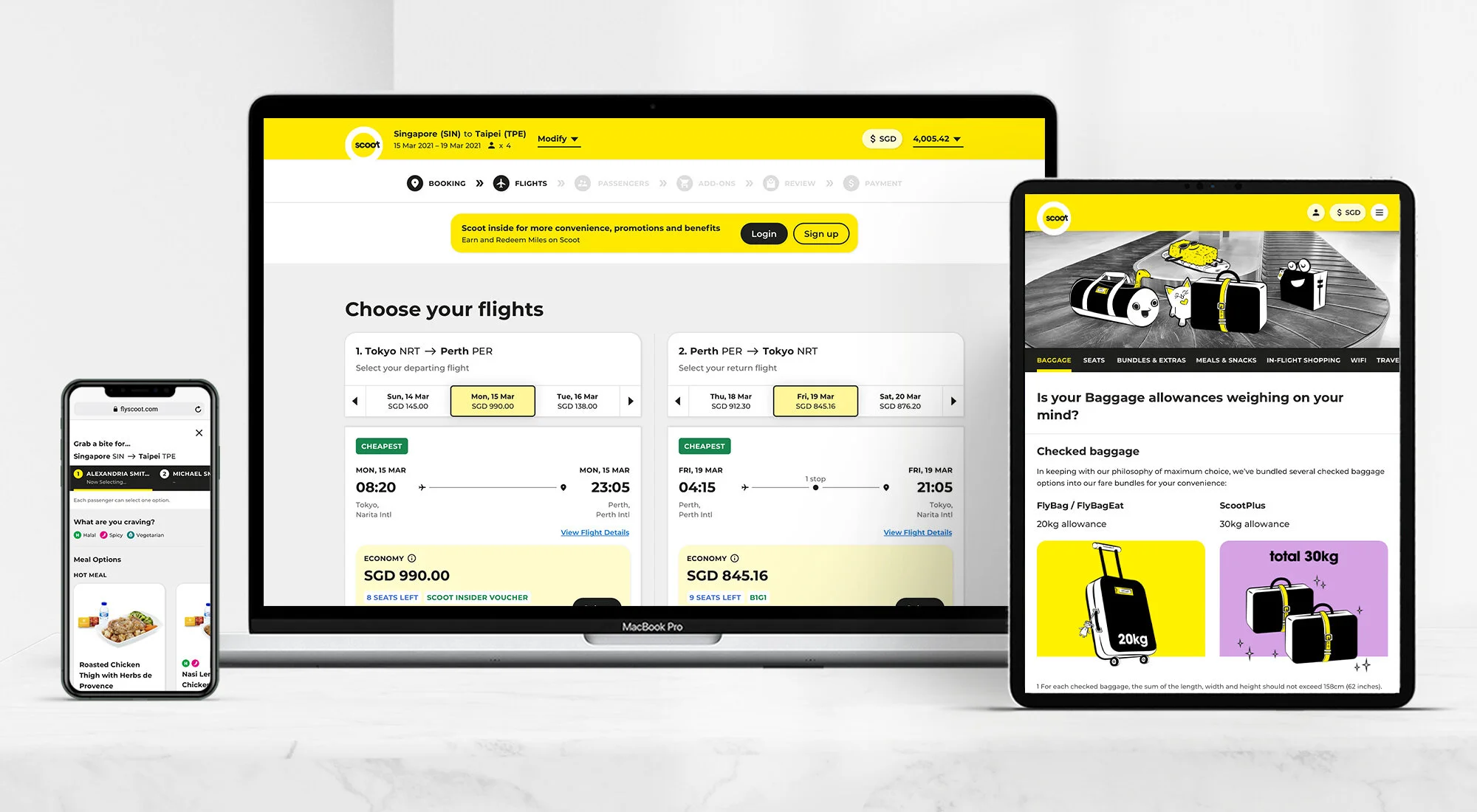


A web design system to refresh an airline’s web presence
Project type
Global web design system for a low-cost airline’s web revamp — scope includes both flight booking, and non-booking pages
Completed 2020/21
My role
Working under Mullenlowe Singapore for a Singaporean low-cost airline, I was the lead UI designer that conceptualised and designed the refreshed web look and feel, and the initial leg work of the global web design system.
Upon handing over to another UI designer who would maintain and expand on this design system, I continued overseeing the design production process all the way to handover to our FE dev team.
Tools
Sketch, Invision, Zeplin
The larger project team
Our cross-functional team consists of digital strategists, UX designers, and FE developers. We work in close collaboration with our client’s different stakeholders, product owners, and product designers.
The brief
The iconic Singaporean low-cost airline needed a refresh of their web presence, for both their flight booking and non-booking web experiences.
The goal was to create a fresh and functional design, while staying true to the brand’s iconic look, and their brand tagline of “Escape the ordinary”.
So we asked…
“How do we instil the excitement of traveling and the inspiration to escape on a highly functional site?”
Our competitors
Taking a quick glance at our direct competitors, their web templates are more or less of the same vein, where the focus was heavily on deals and promotions, and much less on brand differentiation (this is where our brand will get to shine).

The old website
The current library of illustrations, and colour palette has captured the fun and curious travel spirit perfectly… but that energy was not fully translated in the old web layout and content presentation.

The previous flight ancillaries and bundles were also not robust enough. The flight booking experience was an area we were also looking at during the redesign.

Leading up to the concept
Prior to the look & feel proposal — together with the strategy and UX team, we conducted a few months of findings gathering through stakeholder workshops, data analytics, and market research. This eventually outlines the requirements that will inform our design.

These findings were also translated into specific design action points that leads up to our proposal. An example:

The Proposal
A city is much more than just its name: there’s eye-opening culture, unique flavours, vibrant seasons, awe-inspiring landmarks and chock-full of life-enriching experiences.
But the excitement of travelling doesn’t start there; it starts when your innate sense of curiosity leads you to a spontaneous discovery.
“Travelling is about having fun, the ‘oohs’ and ‘ahs’. That itch you get when you’re ready for an adventure.”
The client embodies this spirit in their tagline perfectly: “Escape the ordinary”, a joyful and exciting celebration of a human essence: the spirit of exploration.

A full bleed hero masthead area showcasing various destinations at random


An inspirational content component — inspire with destination type content, instead of only showing city names and prices
A sneak peak at an old rejected draft (which we loved as well)

Moving to UI Production
Upon approval of the new look & feel with client’s c-suite, we kick started our UI production process.

Working in close proximity with our UX designer, the client’s product owner and UX designer, we worked on solutioning the translation of business and user requirements to wires and eventually to high-fidelity interfaces.

The Web Design System
During UI Production, we also cross check and revise our designs according to:
Web Content Accessibility Guidelines (WCAG) AA Compliance
Bootstrap v4.0 Best Practices
Component-based Design Best Practices
We delivered web desktop and mobile page templates, together with a design system in 6 UI states, 3 break points, and with each component’s min. and max. states.
This is handed over to our FE development team, and our UI work ends here.


My takeaway
An absolutely invaluable experience with a steep learning curve — this was a web revamp project of a massive scale.
Through this project, it has become ingrained in my muscle memory, the best practices of component-based design systems, and WCAG compliances. What I’ve learnt in technical knowledge increased in leaps and bounds.
Talking to stakeholders and understanding the business aspect of the aviation industry was also insightful in providing a different perspective in designing solutions. Not to mention the improvement in my confidence and skills with stakeholder management.
While we work on fulfilling business requirements, at the end of the day it is always a fine balance to execute with constant mindfulness that we never stop designing for the user.
As this project was happening during the second half of my stay in the company, it is with regret to say that I did not stay long enough to see this project go live first-hand.